Bonjour
J’ ai réalise la page suivante
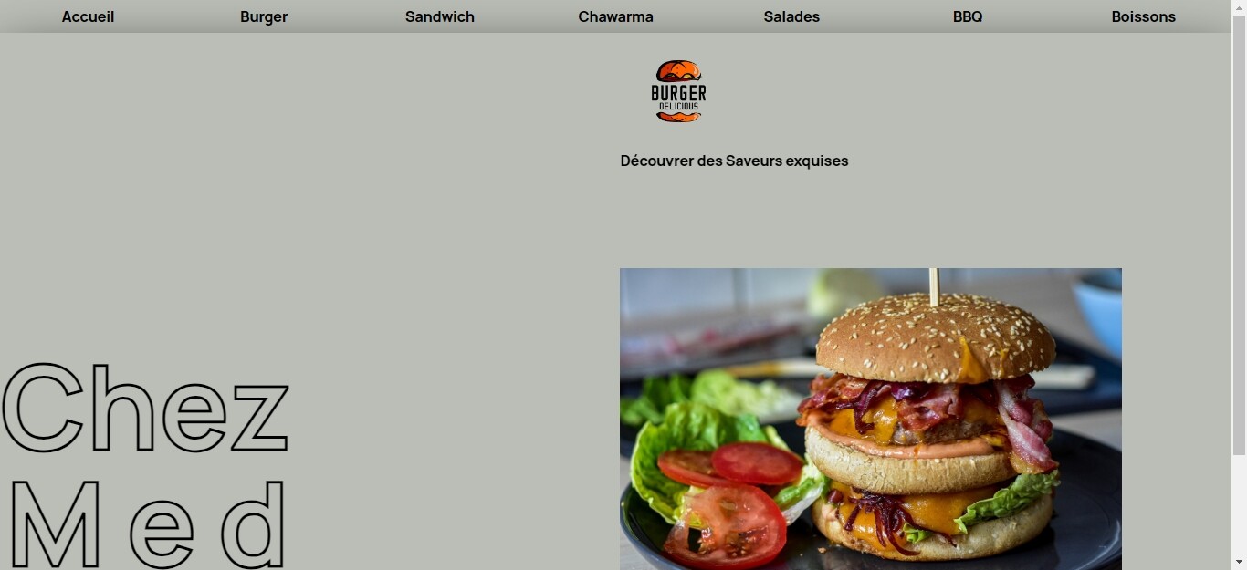
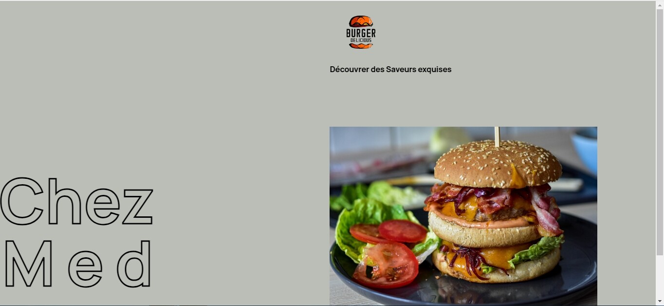
code html:
<body>
<nav class="menu">
<a href="#">Accueil</a>
<a href="burger.html">Burger</a>
<a href="sandwich.html">Sandwich</a>
<a href="chawarma.html">Chawarma</a>
<a href="salades.html">Salades</a>
<a href="bbq.html">BBQ</a>
<a href="boissons.html">Boissons</a>
</nav>
<main>
<div class="container" >
<div class="title">
<div class="title1">
<h2 class="s0">
chez
<span class="first-line">
med
</span>
</h2>
</div>
</div>
<figure class="logo">
<img src="images/logoB.png" alt="Logo">
<figcaption>
<span> Découvrer des Saveurs exquises</span>
</figcaption>
</figure>
<div class="pictures">
<img src="images/burger.jpg" alt="Hamburger">
</div>
</div>
</main>
<footer>
<p>© Copyright     Chez MED   2023</p>
<p><img src="images/loc.png" class="localisation" alt="Adresse">2152    Boulevard des ULYSSES</p>
</footer>
</body>
</html>
je désire positionner mon menu en position fixed a fin qu’il tienne en place lors du scroll le soucis est que ce faisant mon menu disparait
mon css:
*,*::before,*::after{
    box-sizing: border-box;
    margin: 0;
    padding: 0;
}


@font-face {
    font-family: 'Manrope-Bold';
    src: url('fonts/Manrope-Bold.woff2') format('woff2'),
    url('Manrope-Bold.woff') format('woff');
    font-weight: normal;
    font-style: normal;
    }


    @font-face {
       font-family: 'Manrope-Light';
       src: url('fonts/Manrope-Light.woff2') format('woff2'),
       url('Manrope-Light.woff') format('woff');
       font-weight: normal;
       font-style: normal;
    }


    *{
        font-size: 16px;
        font-family:'Manrope-Bold';
    }


    body{
        background: #BABEB6;
       height: 100vh;

    }

.menu {
display:flex;
flex-wrap: wrap;
}


.menu a{
    flex:1;
    color: black;
}


 a:link {
    text-decoration: none;
    color: black;
   }

  .menu a:hover {
    background-color: #f3ebe0;
  }


.menu a{

    text-align: center;
    padding: 7px 0 7px 0;
   }


main{
    position: relative;


    }


.pictures{
width:550px;
margin-bottom:0;
}


.pictures img{
    width: 100%;
    height: 100%;
    display: block;
    }

    .pictures{
        position: absolute;
        bottom: 0;
    }


img{
width: 50%;
margin-right: 200px;

}

.container{
    box-shadow: 0 2rem 4rem #000;
    z-index: 2;
    background-color:#BABEB6 ;
    min-height: 100vh;
  position: relative;
  overflow: hidden;
}


.title{
    grid-area: titre;
    width:450px;
}

.title{
    display: flex;
    align-items: flex-end;
}
.title1{
padding-bottom: 25px;
}


.logo{
    grid-area: logos;
}

.pictures{
    grid-area: image;
}

.container{
    display: grid;
    grid-template-columns: auto  minmax(100px,200px);
    grid-template-areas: "titre . . . logos ."
                          "titre . . .  image .";
}


.logo{

    width: 39%;
    height: 32%;

}


footer p{
    text-align: center;
    font-size: 1em;
    font-style:italic ;
    font-family:'Manrope-Light';
    margin: 12px auto;

}

.localisation{
    width: 18px;
    height:auto;
    margin: auto 0;
    margin-right: 12px;
}

footer{
    position:sticky;
    bottom: 0;
    padding: 2vmin 2rem;
   z-index: 1;


}

.s0{
font-weight: bold;
font-size:8em;
text-transform: capitalize;
position: relative;
-webkit-text-stroke: 3px black;
color: transparent;
line-height: 1;
}


.first-line{
font-size: 1em;
    display: block;
    letter-spacing: 23px;
    padding-left: 6px;
}


figure{
    display: flex;
    flex-flow: column;
}
pourrais avoir un element de reponse SVP ?
Merci.